Difference between revisions of "Low Vision"
Jump to navigation
Jump to search
| Line 44: | Line 44: | ||
* [http://www2.ca.uky.edu/HES/fcs/FACTSHTS/HF-LRA.151.PDF Responding to Color (PDF)] by the Cooperative Extension Service of the [[University of Kentucky]]. | * [http://www2.ca.uky.edu/HES/fcs/FACTSHTS/HF-LRA.151.PDF Responding to Color (PDF)] by the Cooperative Extension Service of the [[University of Kentucky]]. | ||
* | * [https://accessibility.blog.gov.uk/2016/09/02/dos-and-donts-on-designing-for-accessibility/ Dos and Don'ts on designing for accessibility] and the accompanying poster on [https://accessibility.blog.gov.uk/wp-content/uploads/sites/52/2016/09/visually-impaired-low-vision.png designing for users with low vision (PNG)] by [[Karwai Pun]] at the [[UK Accessibility in Government Blog]] | ||
Revision as of 21:16, 17 April 2020
Low vision describes any number of situations where a person has lost a significant amount of their vision, but not enough to be considered blind. It can be caused by any of a number of factors, each of which presents as a slightly different set of visual challenges. These include:
- macular degeneration
- glaucoma
- diabetic retinopathy
- retinitis pigmentosa
- eye injuries
- eye cancer
- albinism
- brain injuries
- cataracts
- various infections
Design Considerations
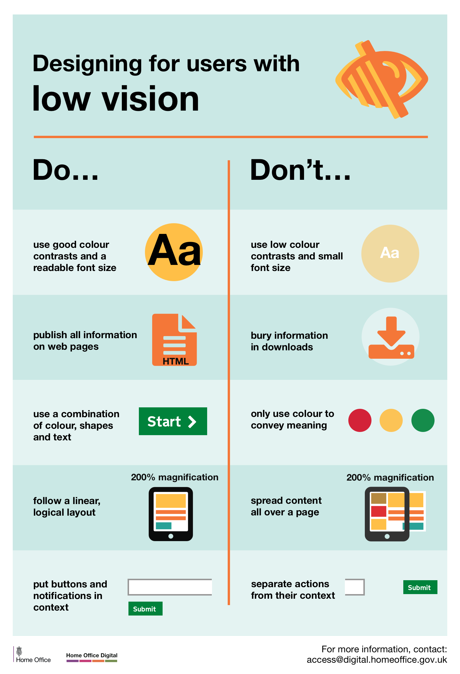
When designing for users with low vision, we need to:
Use good contrasts and a readable font size
- Publish all information on web pages (HTML)
- Use a combination of color, shapes, and text
- Follow a linear, logical layout and ensure text flows and is visible when text is magnified to 200%
- Put buttons and notifications in context.
We need to avoid:
- Using low color contrasts and small font sizes
- Burying information in downloads
- Only using color to convey meaning
- Spreading content all over a page and forcing a user to scroll horizontally when text is magnified to 200%
- Separating actions from their context
How to design mobile app experiences for the visually impaired by Ayesha Zafar on Invision discusses steps specific to mobile interactions.
Tools
- Macular Degeneration simulator and video
- Glaucoma simulator
- Simulator for Macular Degeneration, Diabetic Retinopathy, Cataracts, and Glaucoma
- WebAIM's Color Contrast Checker - will tell you if two colors you enter pass accessibility guidelines
Additional resources
- Responding to Color (PDF) by the Cooperative Extension Service of the University of Kentucky.
- Dos and Don'ts on designing for accessibility and the accompanying poster on designing for users with low vision (PNG) by Karwai Pun at the UK Accessibility in Government Blog